Aurea Identity
The golden ratio of living
Services
Branding
Visual Identity
Deliverables
Brand identity, print collateral, visual guidelines
Year
2025
Client
Aurea
Info
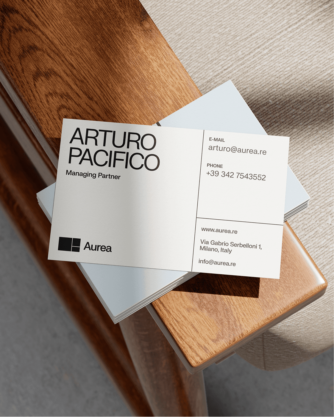
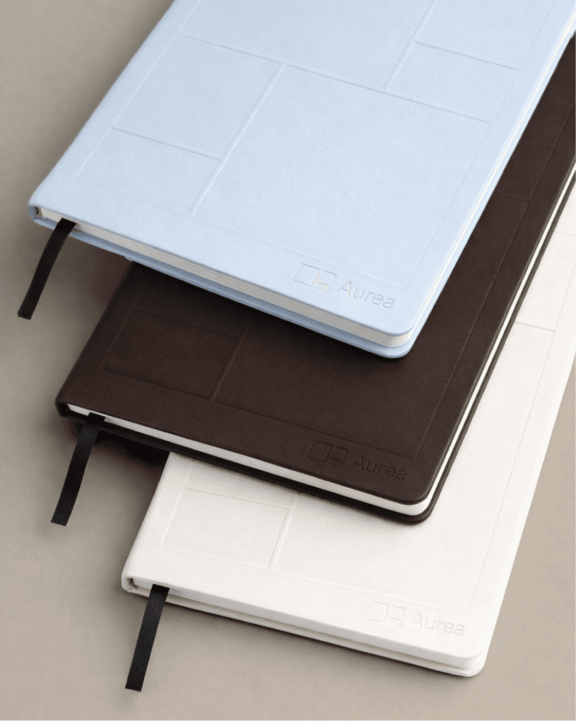
Aurea works in residential acquisition, development and regeneration, with a clear ambition to bring back trust and peace of mind to people looking for a home, while improving the quality of life in the places they live. For this project I created the full visual identity, from the logo to all printed materials. The idea starts from the golden ratio as a direct nod to the name Aurea and turns it into a kind of window onto the spaces the brand helps to create and transform. The logo grid subtly recalls a floor plan, tying the identity back to the act of designing homes and lived-in spaces, and finding a balance between structure, warmth and a human touch. This grid then lives across the printed materials as an image layout system, so the photography quietly follows the proportions of the logo in an elegant, non-obvious way. In this way the branding is always present, but never too loud or in your face.